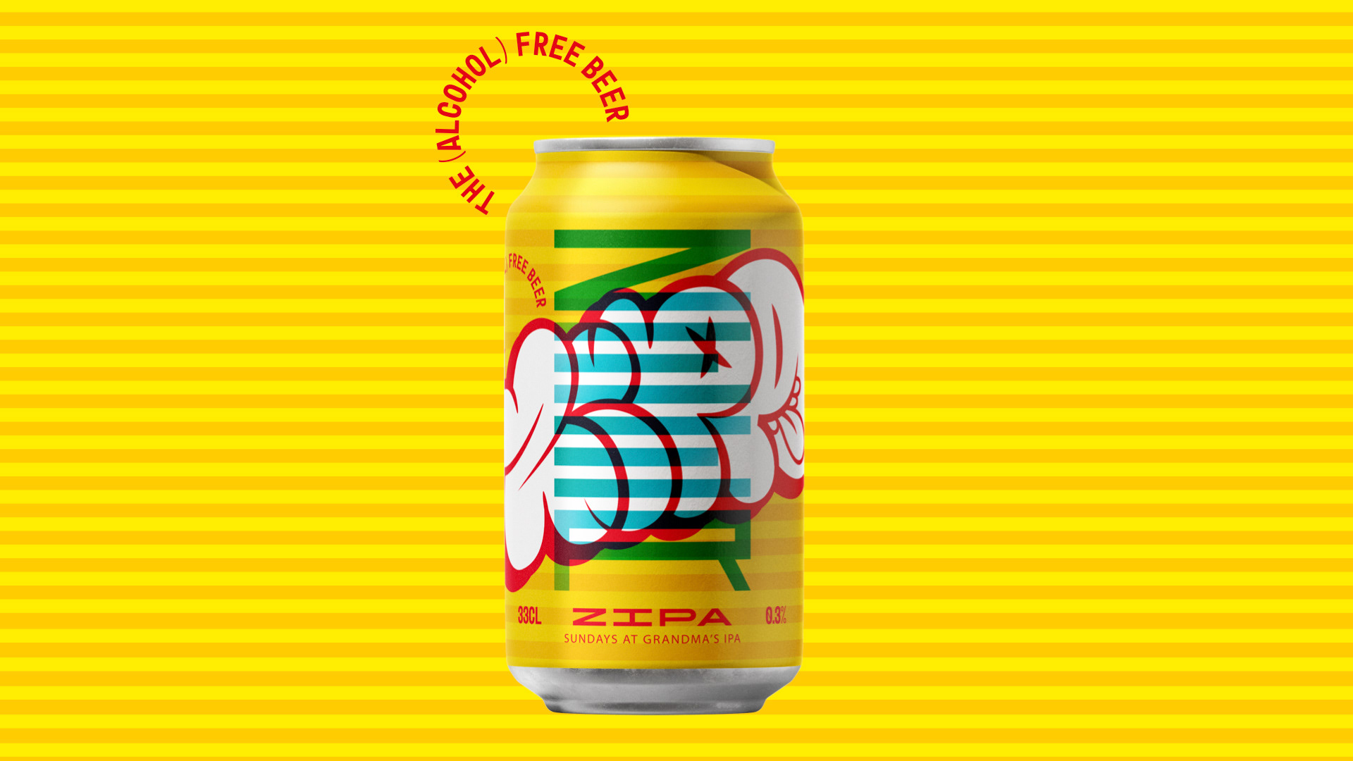
ZEER is an alcohol-free beer brand built around bold character, playful expression and a visual identity that refuses to blend in.
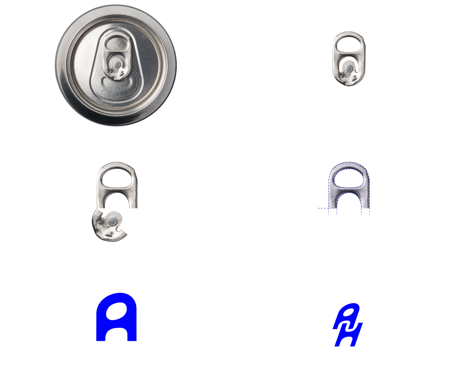
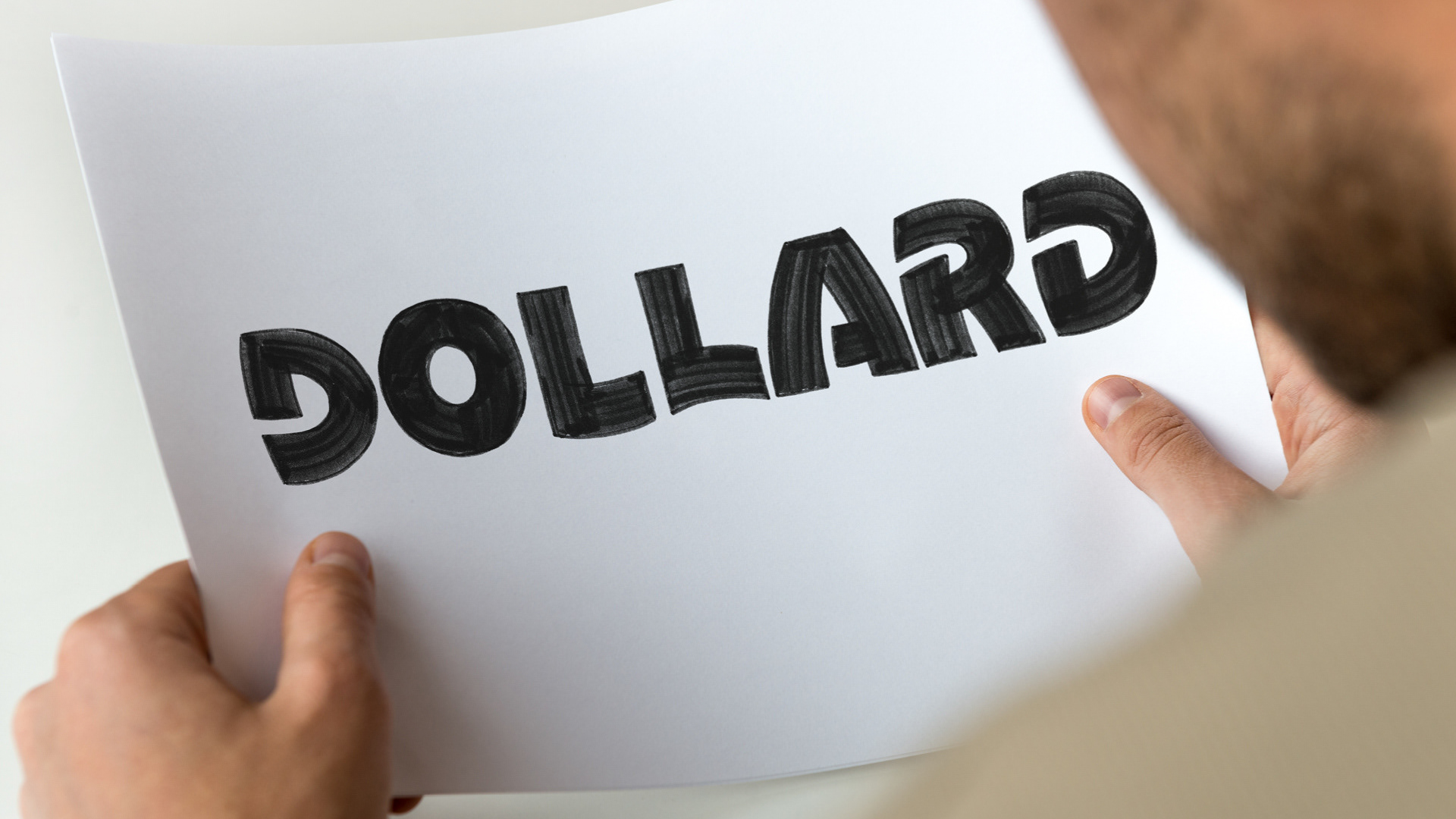
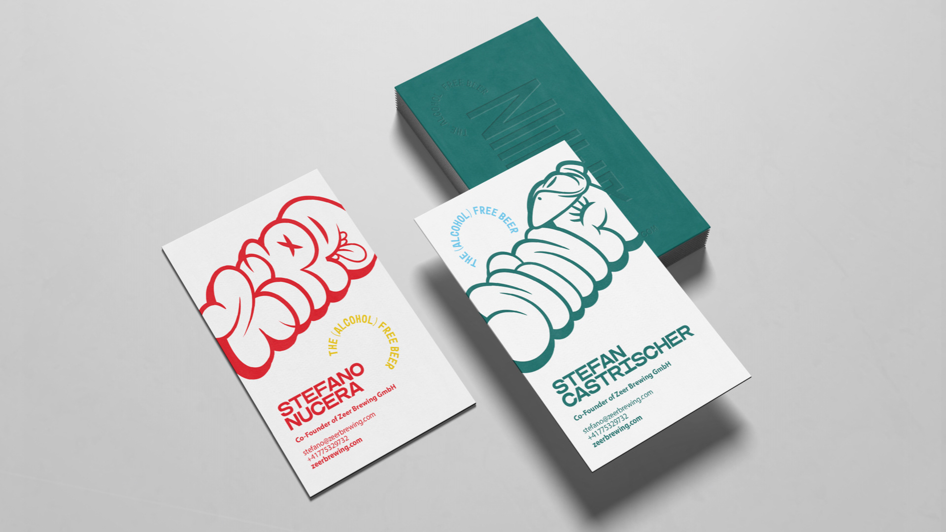
For ZEER, I developed the visual identity from the ground up — designing the logo, typography, colour palette and packaging system. The aim was to create a brand that feels energetic and distinctive, while moving away from the more predictable visual language often associated with alcohol-free beer.
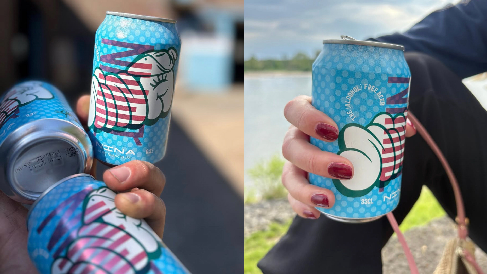
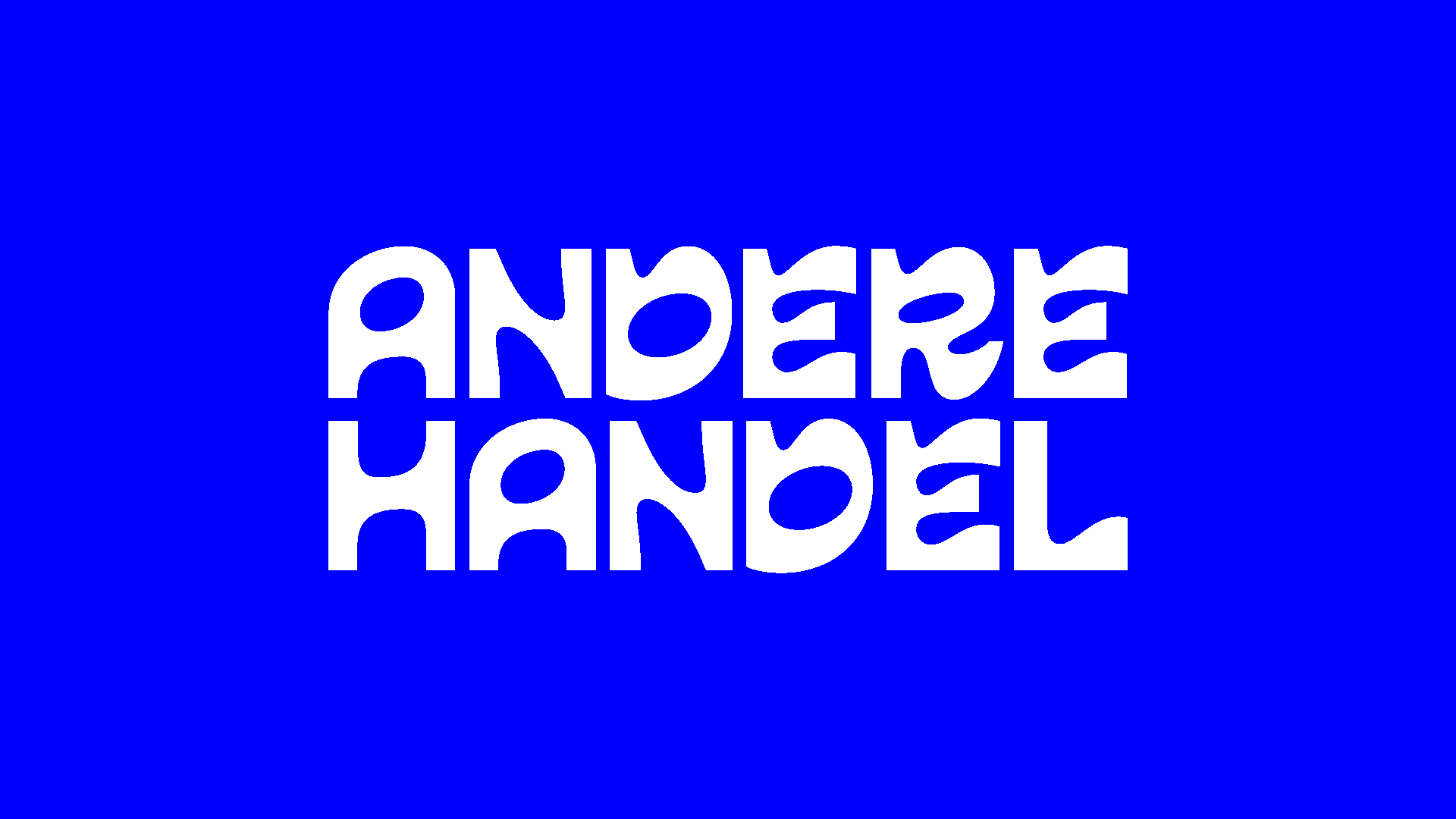
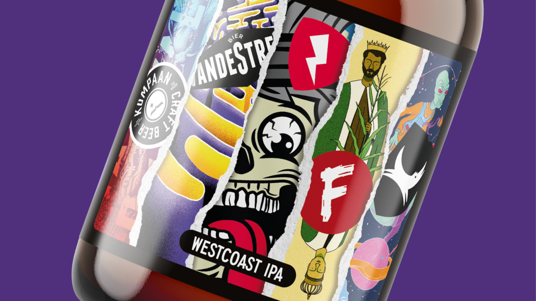
At the heart of the identity is a bold typographic logo, combined with expressive illustrated characters and graphic patterns. Together, these elements form a flexible visual system that gives each beer its own personality while keeping the range recognisably ZEER.
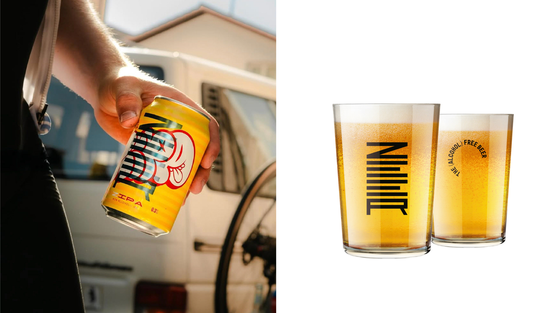
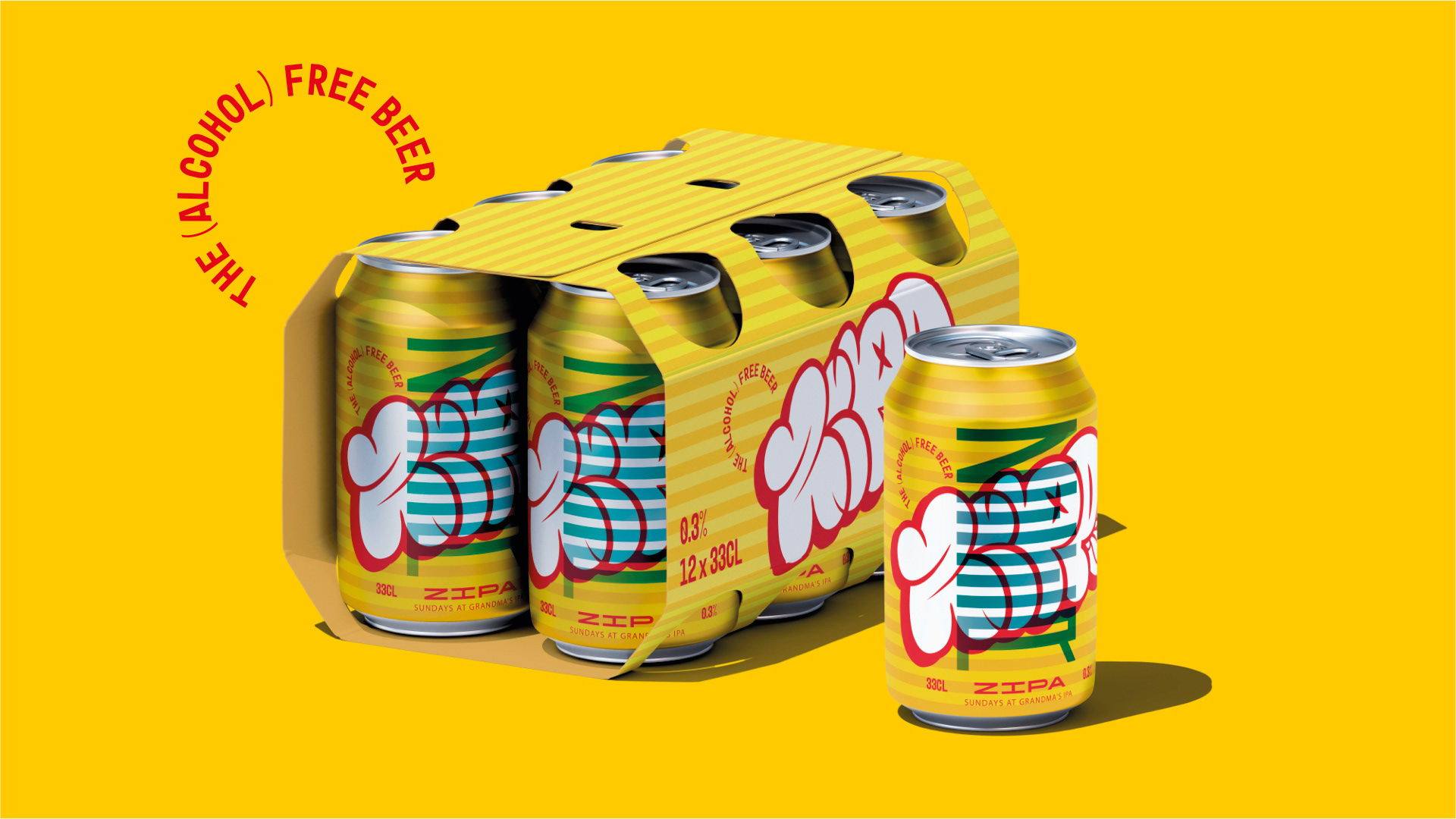
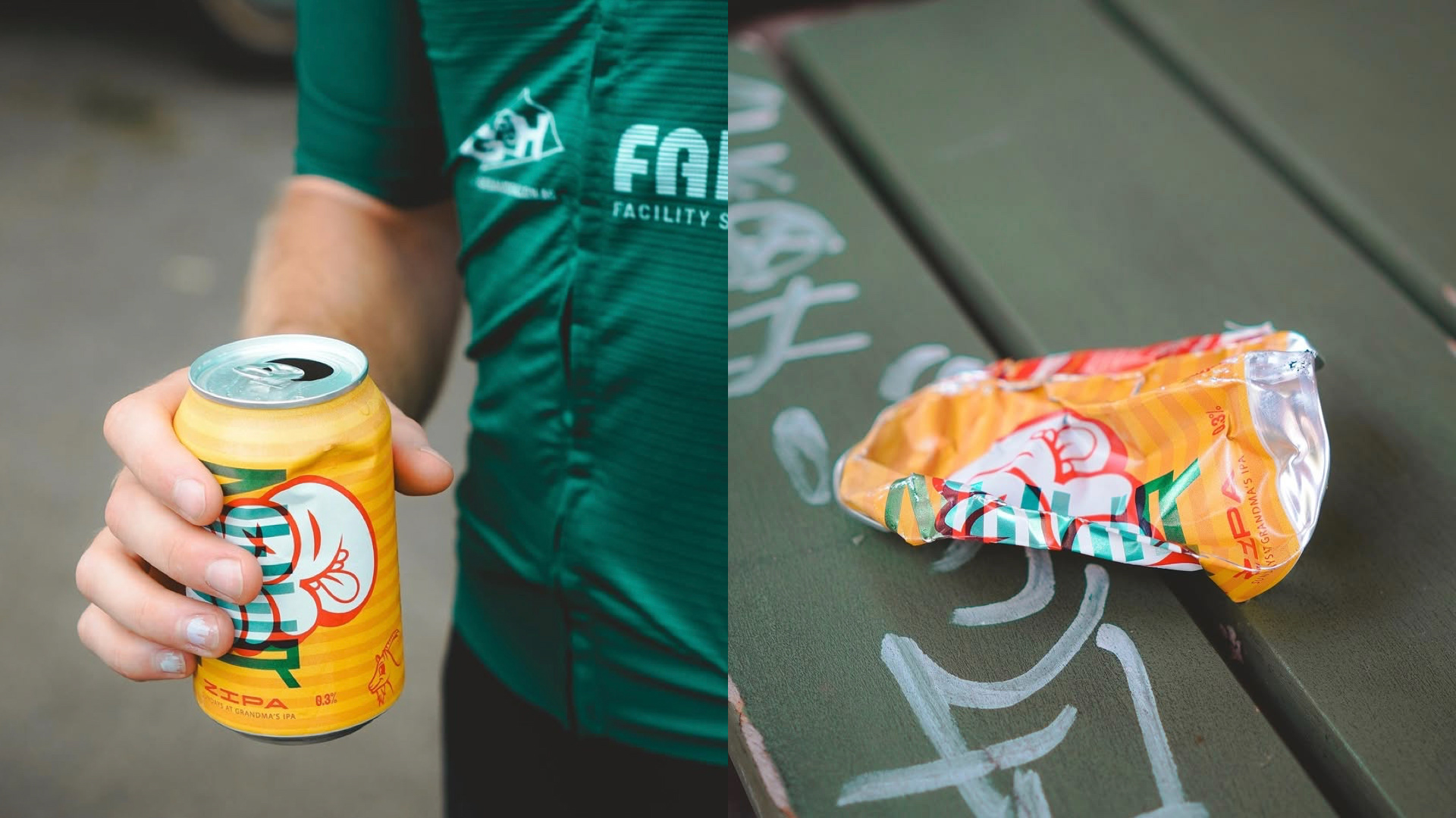
ZIPA and NINA were the first two beers to launch the identity. Their packaging established the foundation for the wider range: vibrant colours, oversized graphics, playful typography and a strong shelf presence. As new beers were introduced, the system evolved into different colourways, patterns and characters without losing its core identity.
The result is a brand world that feels colourful, confident and a little unconventional — designed to make alcohol-free beer look just as exciting as anything else on the shelf.